DESIGN LEAD
Unifying the DraftKings Account Platform
When DraftKings went from a single-product operation to today, now a suite of product offerings, much debt had accrued along the way. And the areas where this was piling up the most was across the account system. So as the design leader in this space, I needed to provide a vision and strategy on how we would pay down this debt and ultimately set us up for success as the product suite continued to expand.
Building the Case
To sell the idea of a unified account system across all of DraftKings products, I needed to look into our quantitative and qualitative data sources to begin shaping the core problems. I wish there was one clear smoking gun of a data point that could point to this new experience as the solution, but instead, I needed to tap into different resources to identify the problems.
Workshops with internal stakeholders:
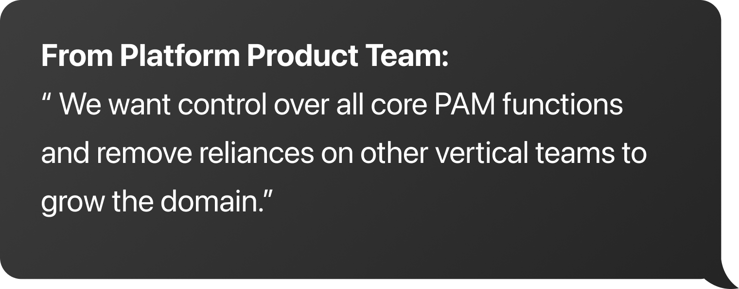
With the help of my research partner, I conducted a series of workshops with teams to identify what pain points they felt with our current architecture. We resulted in some fantastic findings. For example, our engineering team's biggest pain point was the development cost they accrued when fixing, modifying, or adding a new account feature.
Competitor audit:
I looked at similar product companies that leverage a centralized account system. We're taking Google, Atlassian, Meta, Microsoft; and we identified their similarities with each other and DraftKings.
Customer support (CX) & External reviews:
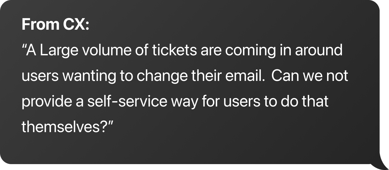
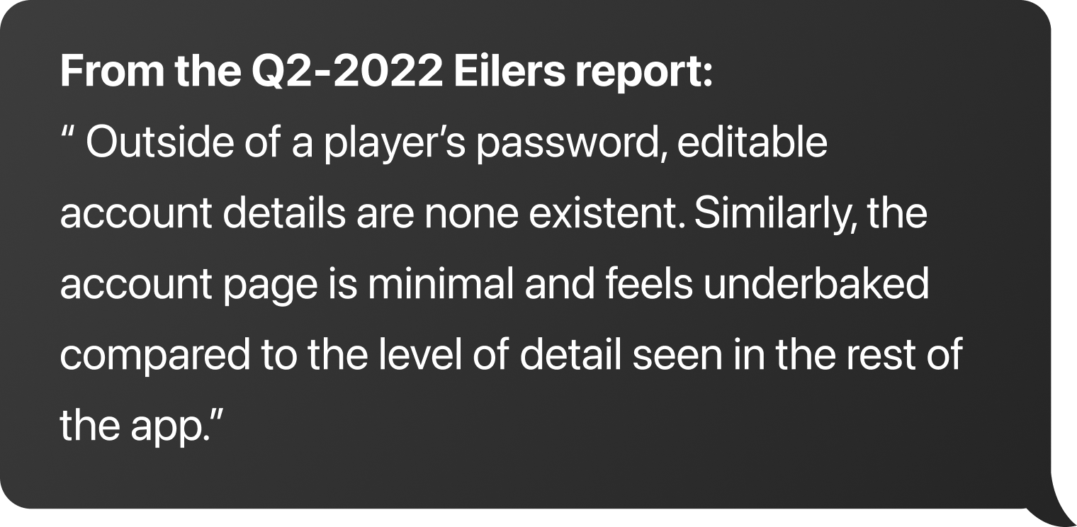
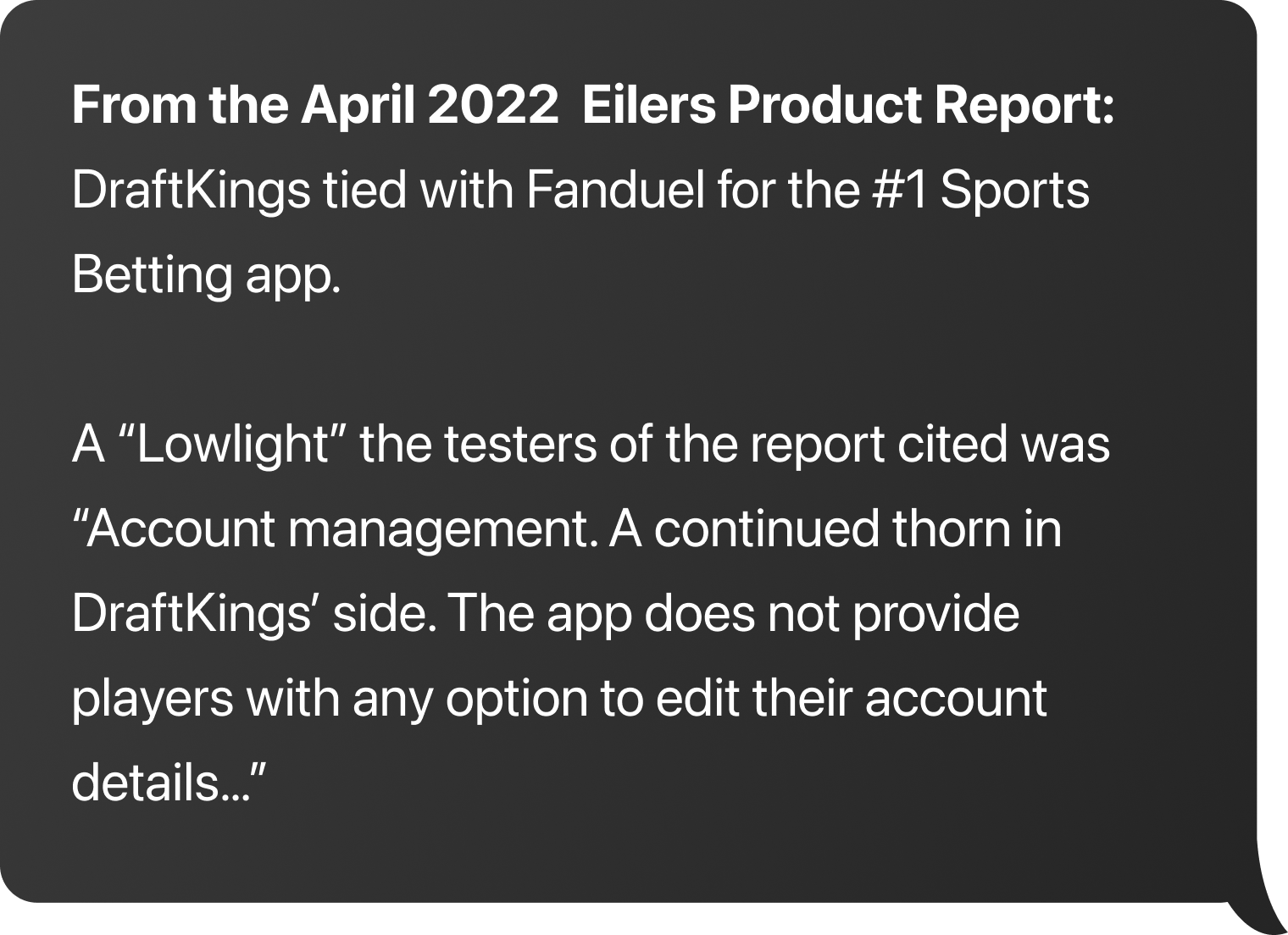
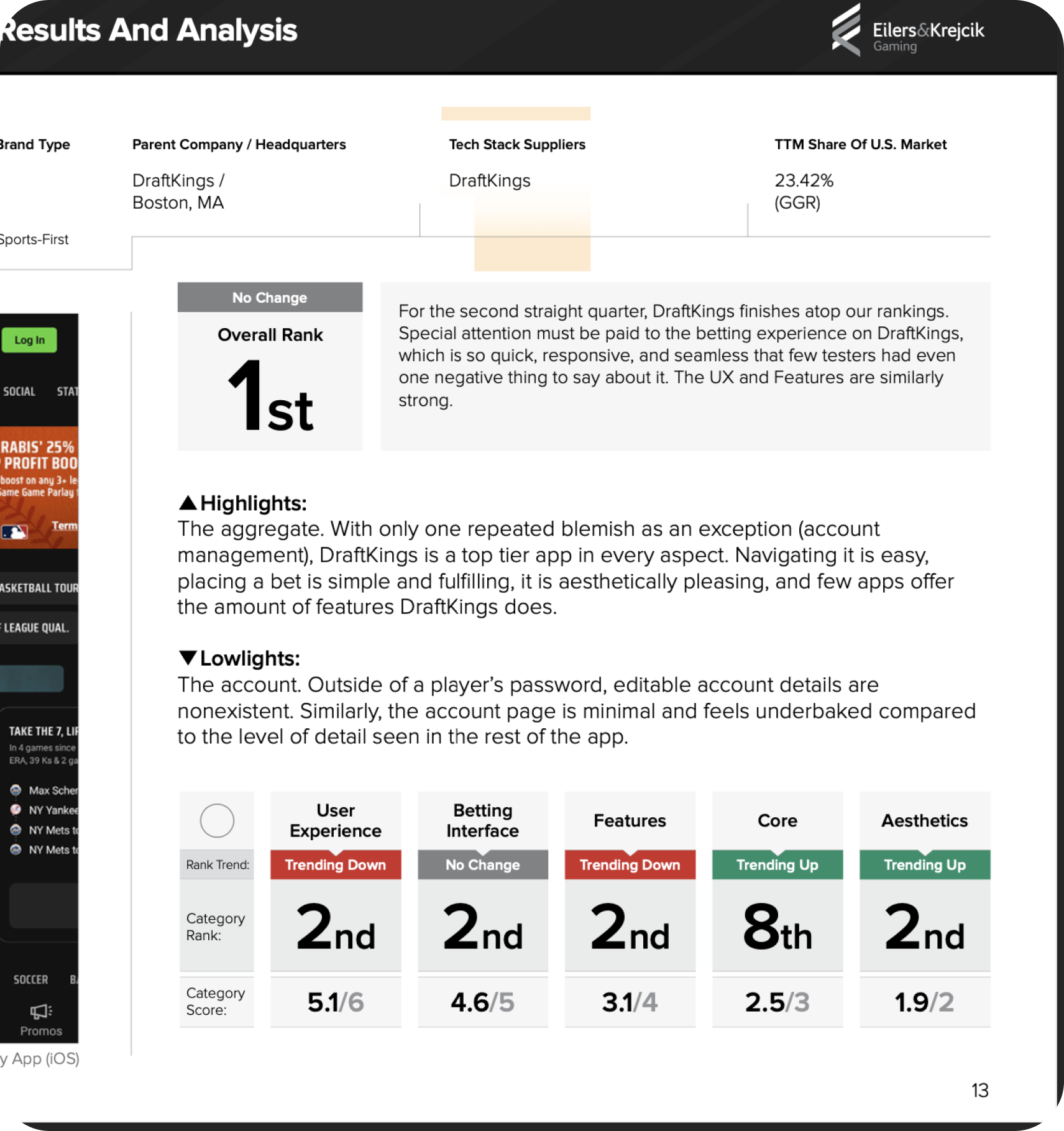
We went straight to the source of customer feedback and aggregated feedback through our internal team. And lastly analyzed our scores from the industries independent online gaming report (Eilers).
Problem(s)
After this investigation, we rallied around three core problems.
Scalability
The current scheme does not allow the business to scale our Player Account Management (PAM) system to new products or brands. Plus, some of the oldest parts exist on legacy technology that is difficult and fragile to work within.
Growth
We have constant improvements, new functionalities, and optimizations coming in from our product, compliance, and internal teams, not to mention our users themselves from our testing and research exercises.
Consistency
The prior system consisted of legacy and new pages scattered across two primary account instances (DFS & Gaming). There were inconsistent styles across the pages, duplicate or incomplete features, and different access points across the products themselves.
Goals
In partnership with our product goals, I also drafted several design goals for my team to refer to as they designed in this space. With this project, having clear goals outlined from the beginning kept us on a clear path through the design phase.
Product Goals
#1 25% Reduction in customer support tickets
#2 10% Increase in CSAT score
#3 Achieve #1 Rank in Eilers scores across Core & Aesthetic categories
#4 100% Adoption across product verticals
Design Goals
Regardless of the DraftKings product, users have a reliable and consistent way to get to their one account.
Consistent access
The end-to-end experience needs to feel harmonious.
One look & feel
Many experiences, features, and functions are commonplace in the broader product world, so we should maintain familiarity.
Maintain the wheel
We have so much data collected on our users, so let's be transparent and show it to them. This will develop trust in the experience and the wider brand.
Transparency
Users are not coming to DraftKings just to manage their account settings. Let's get them in and out and back to the game.
Simple and clean
No direct industry competitor is strong in this area, so let's be #1.
Beat the competition
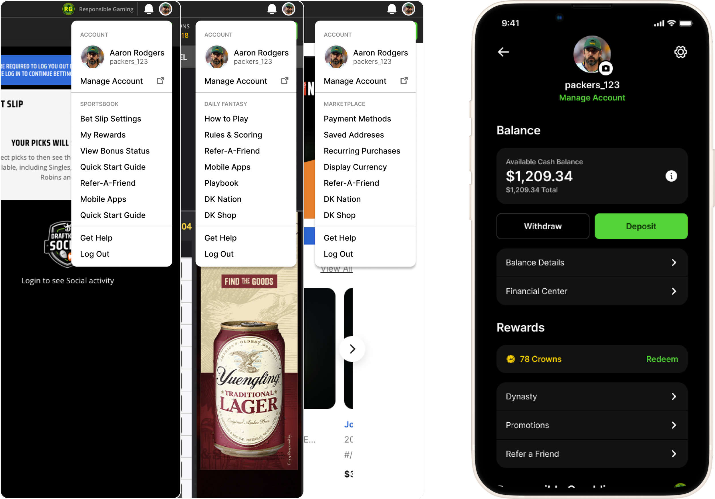
On the left, you can see across each of our product desktop sites that the access point to the Account Center is represented the same way.
On the right is our native app account menu that we use for each of our apps.
We rebuilt our login to be universal and integrated this experience into each of the apps. This way users could be familiar with it regardless of the app they were using.

Project Testing
During the design process, we leveraged different testing methodologies to keep up moving forward.
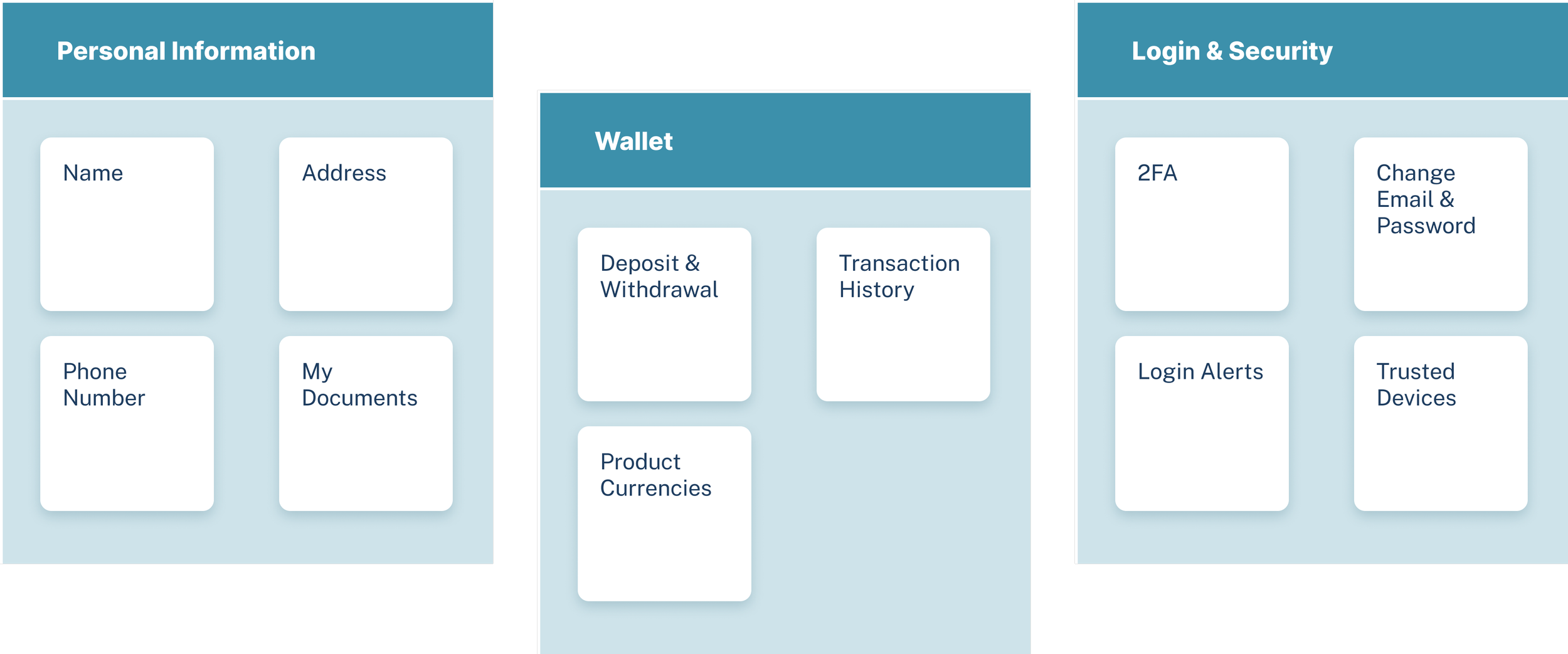
We conducted an open card sort to identify some of our main navigation items and a closed card sorting exercise to determine what features made sense in each one of those areas.
Card sorting exercises
We created variations of our center in different themes so we could settle on the global style.
Theme testing
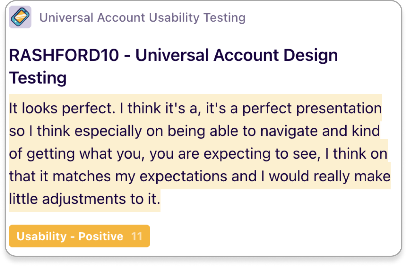
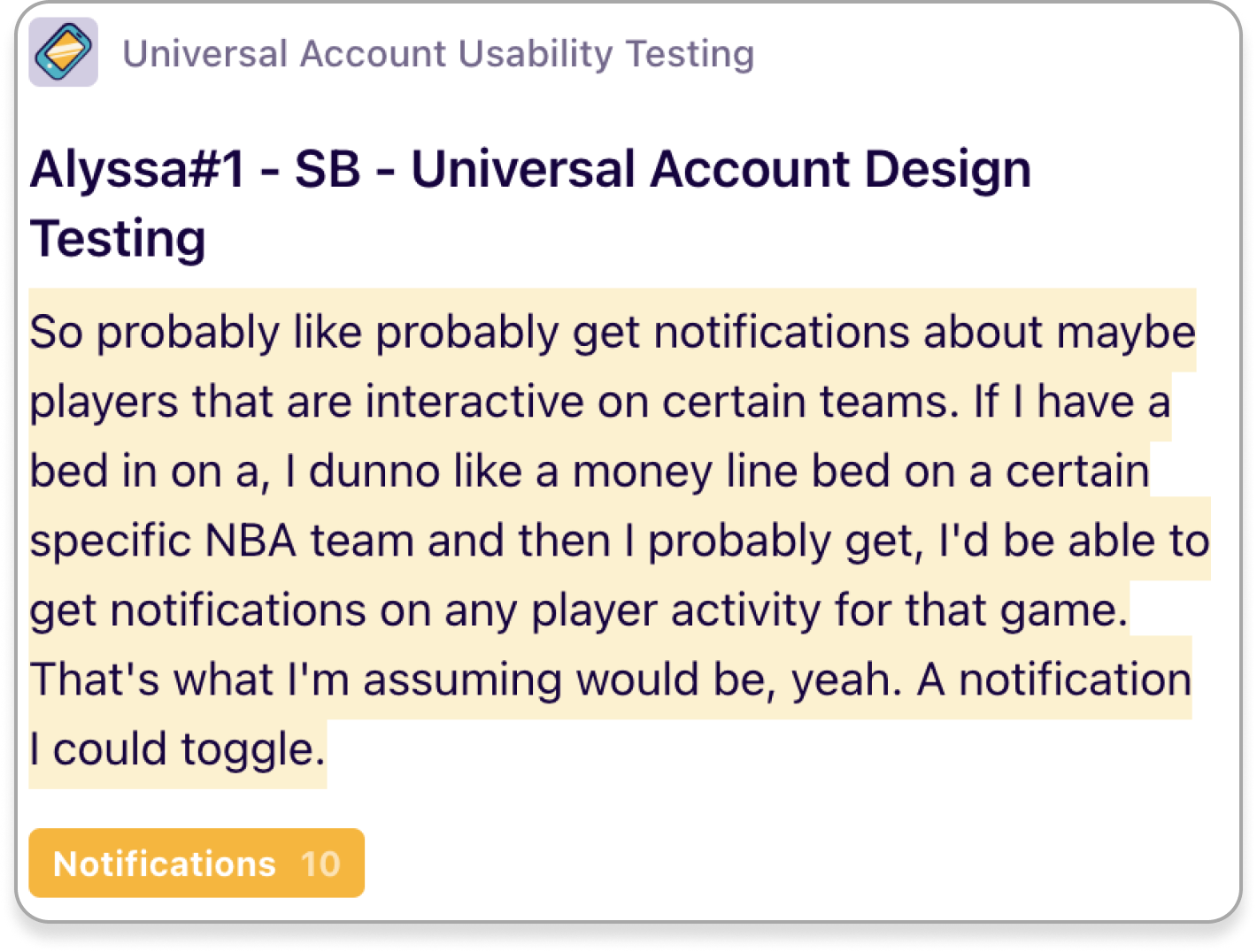
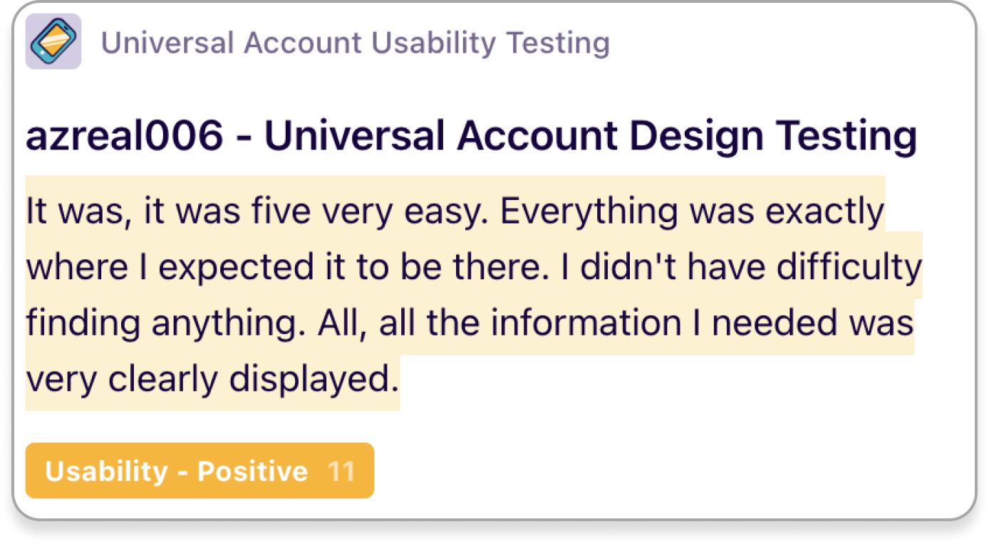
To gather more qualitative data on the end-to-end experience, we conducted a series of moderated user tests with ten existing users.
The goal was to understand if customers can accurately expect what is in each tab of the account center and perform basic tasks so that we know the new account center designs will be easily understood when launched.
Moderated user tests

Final Design Prototype
Results
Once the end-to-end experience was designed, it gave our product and engineering teams a clear roadmap. We wouldn't be able to build this entire thing overnight but rather in stages.
Our first stage involved launching our limits and financial pages, which are vital for regulatory reasons and were the biggest contributing areas to user confusion. After this phase 1 launch, we found a decrease in CX inquiries about balance information and an increase in limit usage.